Read more.
VIEW ALL

Some cases are incredibly complex, yet require a great deal of synthesis to translate them into something simple and digestible for the public. That is how we welcomed Grupo Comboi, the Valencian business group that has been proving through its actions how it adds value through its way of doing things.

With three areas of influence—gastronomy, event production, and real estate—working on the group's identity was a major challenge: to encompass these different sectors and communicate the professionalism and creativity they bring to each one, all under a minimalist and recognizable identity.
To achieve this, we navigated the world of symbols. The three dots in their isotype represent these three areas and, at the same time, evoke the concept of a group of friends working together with closeness and passion. Likewise, the "M" represents their dynamic style of collaboration, which grows and flows naturally.
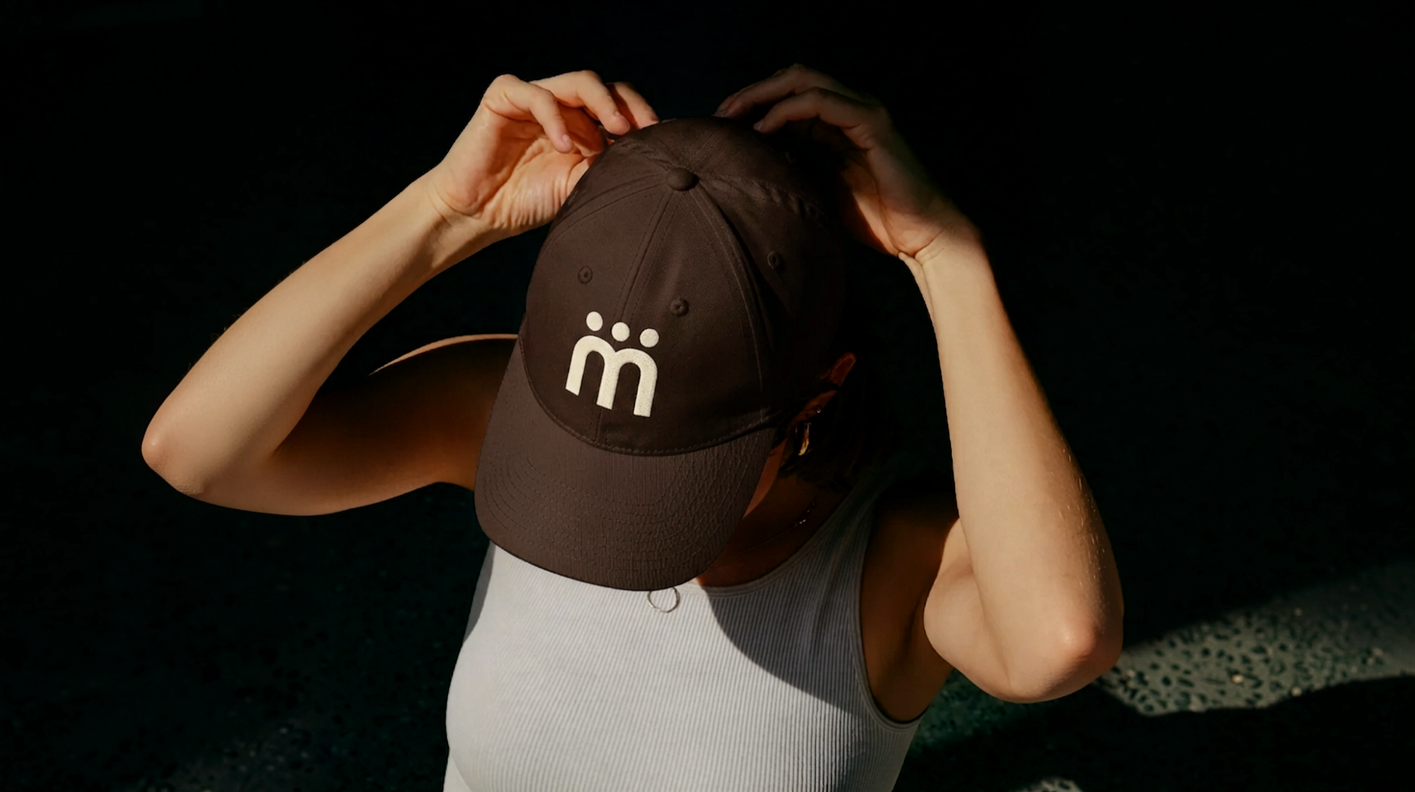
And since everything communicates in an identity, we defined a color palette that perfectly reflects their people-focused spirit, using neutral colors that are, at the same time, a benchmark of style and elegance.
This is how, from the ground up, we created an identity with character, thinking strategically about every point of connection between the group and its audience.
Have you ever stopped to think about the importance of the small elements that build a brand identity?